Why you should implement sign language alongside text
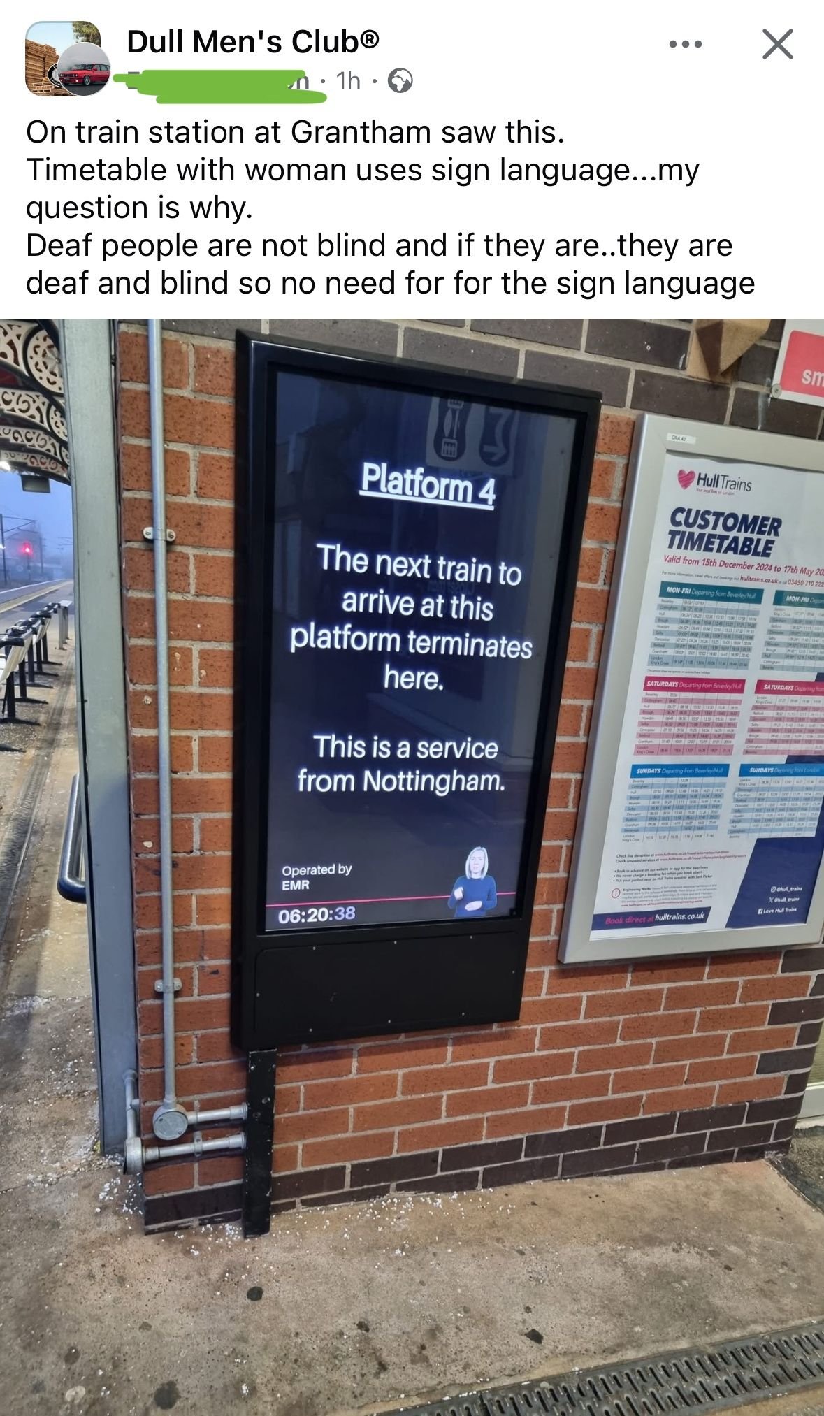
I came across this interesting design choice in a Facebook group: a train station screen displaying a British Sign Language (BSL) interpreter alongside the text.
At first glance, some might wonder: Why include sign language if deaf people can read? It’s a fair question—but the answer reveals an important lesson about accessibility that many designers overlook.
This small detail makes a big difference for those who need it. And it’s a perfect example of why good design isn’t just about what seems logical—it’s about what actually works for people.

How clear form designs reduce user errors
When you use labels placeholder text in your input field, the label disappears once a user starts typing. Error rates spike and filled forms become useless. This is how you prevent that.