V.A.G. Magazine

The rise of the digital press has seen a tremendous peak over the last few years. Publishers are prompted to deliver quality content along with a great digital product for readers to experience a different but still unique act of opening up a magazine and diving into it. The question we needed to answer was:

What would a new, aesthetically pleasing magazine for primary user Candice look like?
Our primary user is Candice. She’s interested in fashion and tech and reads online magazines such as Cosmopolitan, Elle, People and Vogue. But she can barely find any tech news in these magazines.
She also finds it difficult to meet her fashion goals, especially with the magazines People and Cosmopolitan, because they actually focus more on celebrity/gossip rather than actual fashion trends and how she can dress fashionably herself.
To create an MVP website design for Candice, we need to provide an easy and clear online magazine, so that she can find and read articles about lifestyle, which help her understand the latest fashion and tech trends, and how to implement them herself.
Below you can see the MVP as a midfi design.
UI Research
To understand what pleases Candice visually, we researched the look of the magazines that she already reads.
On one hand high contrast, low colour, fashion magazines, with serif fonts for titles, and sans serif fonts for paragraphs. The magazines leave the photo’s to do the talking.
On the other hand we see colourful, bright and busy magazines, with a lot of different font uses as well.
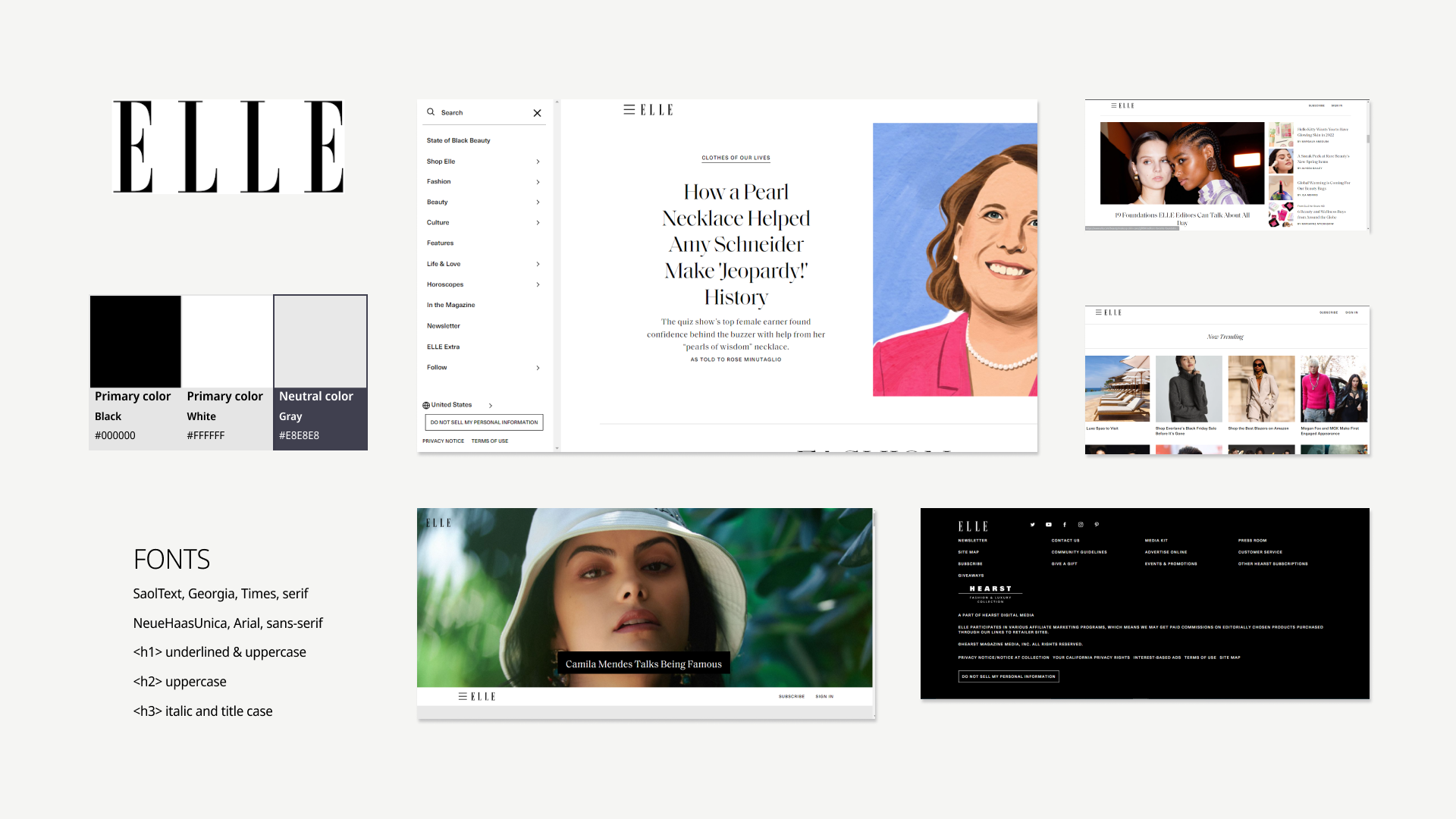
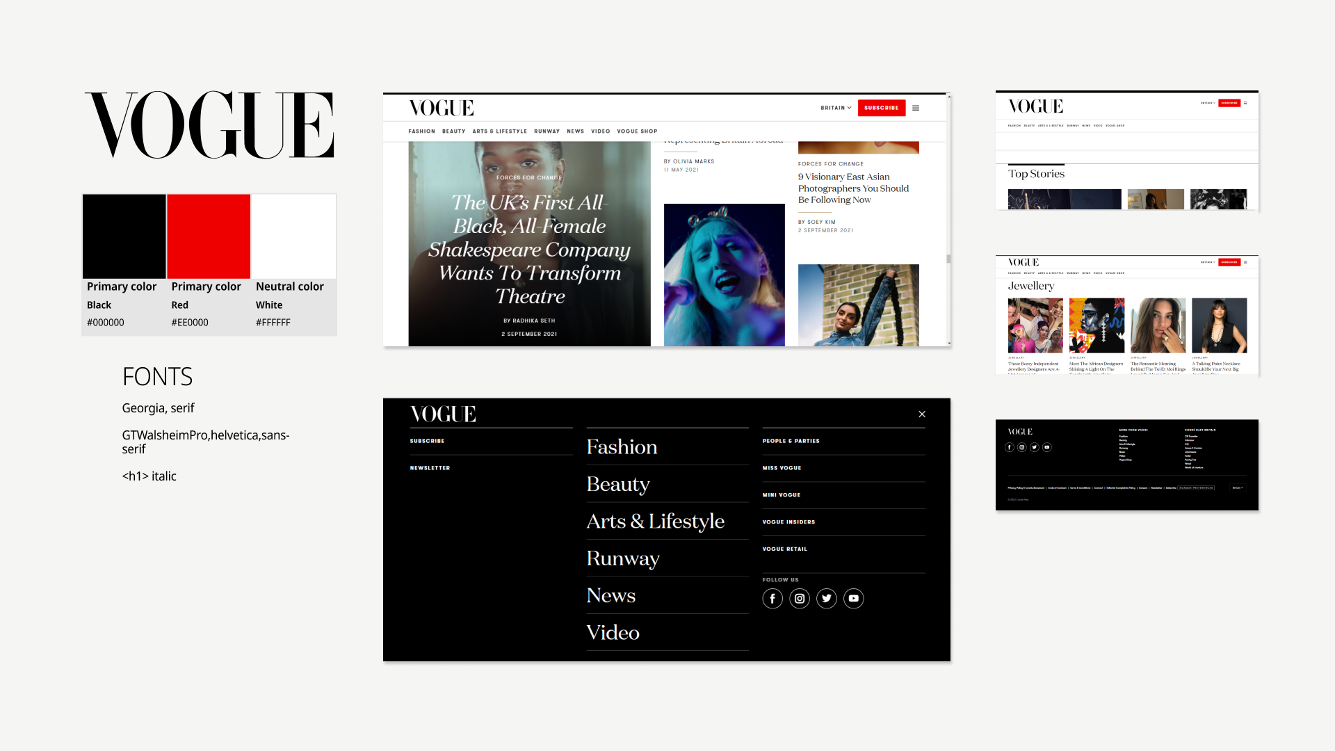
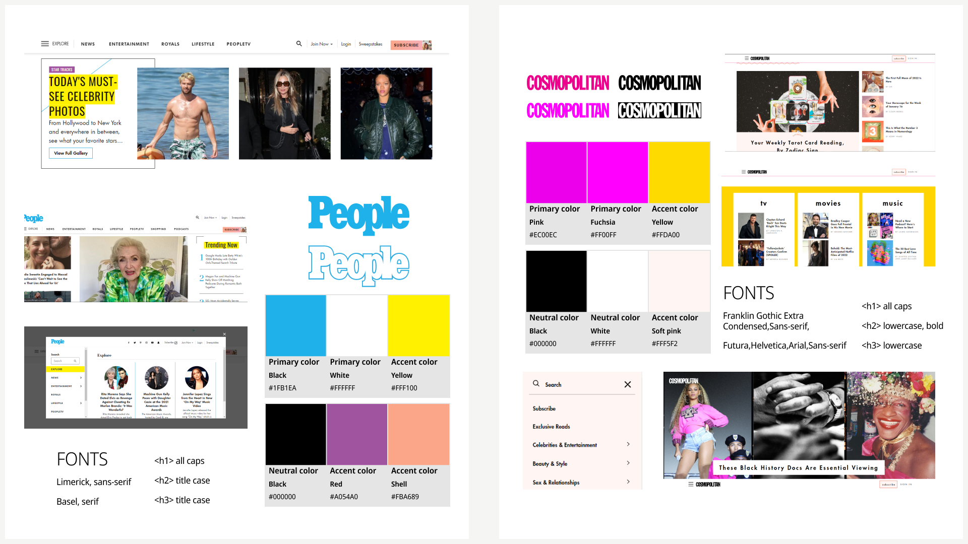
Based on this visual competitive analysis, we knew that with the content we are providing, we needed to design a minimalistic, but expressive and innovative, but edgy magazine ourselves. Below you see the moodboard, final colour test and style tile.

Moodboard v1 and prospected brand attributes

Moodboard v2
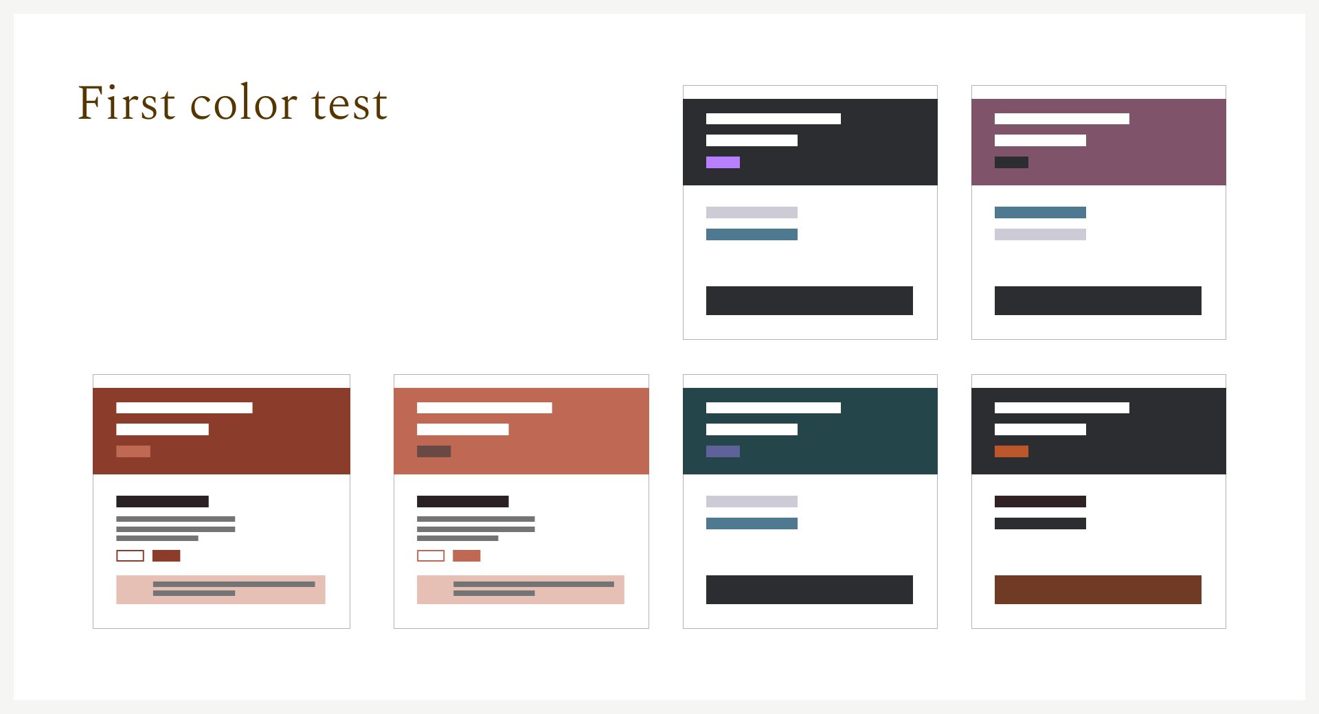
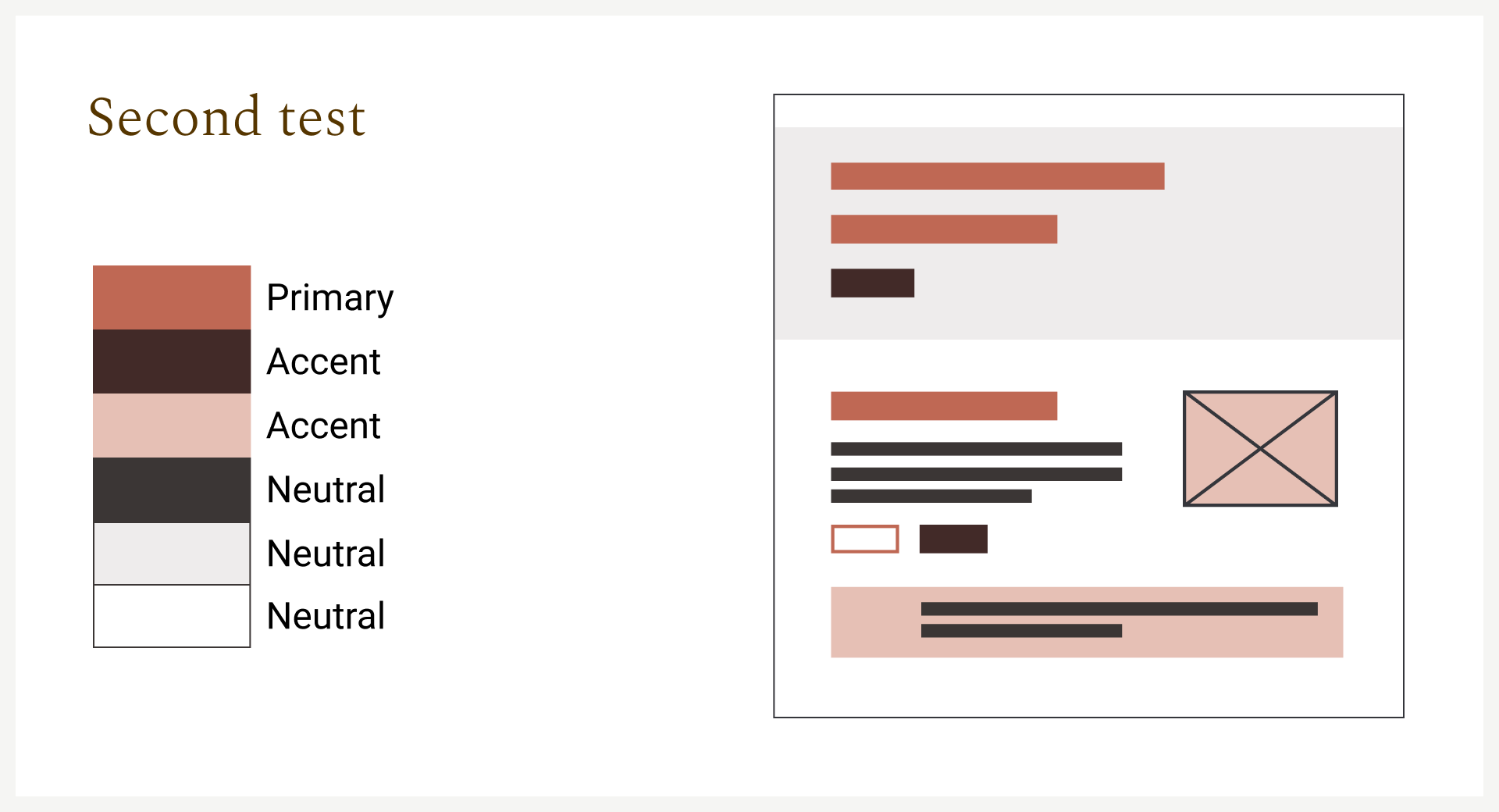
Elaborate color testing
We tried many color combinations to define the correct stile. From dark shades with a splash of color to soft tints that remind of all different skin colors. Finally we landed on a combination that can both be clean and simple as well as expressive, with the bright purple and grey tints and shades.


Brand tile for hifi design
Combined with typography tests and texture tests we landed on the following brand tile. The design needs to be clean and straight forward for the images to speak. That’s why we chose the fonts Bebas Neue and Noto Sans for titles, headers & paragraphs, and clean, stark lines in the buttons and some icons. On the other hand we also need to give ourselves the freedom to also be expressive and edgy. That’s where the quote font and textures come in.
High fidelity prototype
This all converted into the high fidelity prototype you see below.