NewU
Year 2022
My role UX Design, UI Research, UI Design
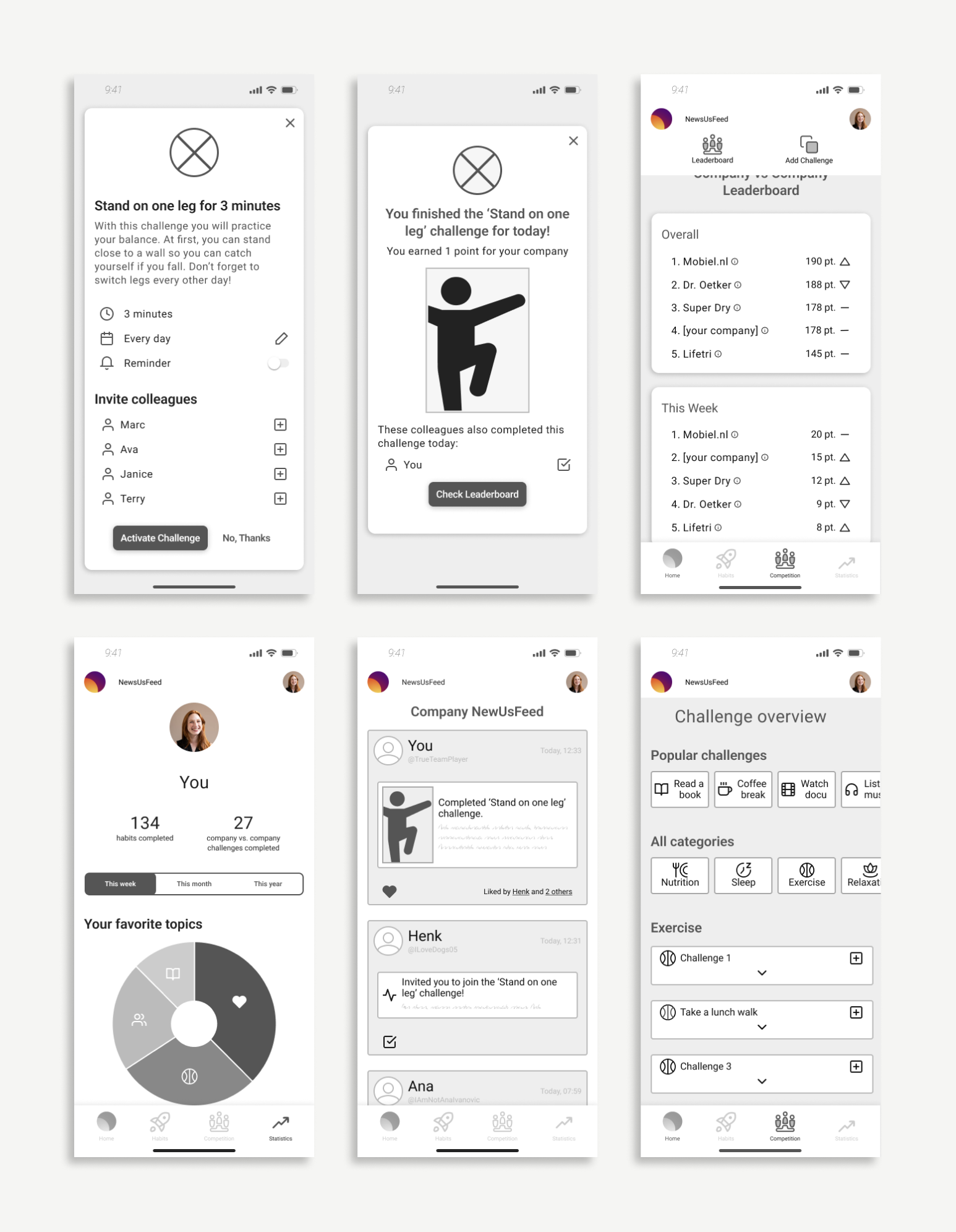
Design a new feature that allows employees of multinationals to compete together against other companies.
The current app
The app currently focuses on creating new habits on your own and competing with your colleagues. This happens both with your teammates as well as against your teammates. A real social aspect is missing here.
UX Research
For this organization, we performed a competitive analysis, user interviews, and researched existing peer-reviewed papers to understand the users.
The competitive analysis shows that NewU could definitely improve on the connection with other users, and the apps that are interesting to look at when it comes to connecting and socializing with other users, as opposed to winning from other users.
But who is this socially competitive user? What do they like? We performed 6 interviews with people who enjoy team building, working out with friends and playing competitive games. We also dove deeper into the psychology behind social rewards. Understanding all of this data we understood for who we had to design: Sam.
Knowing what Sam needs, the feedback we received about the app, and the technical restraints we received from the client, we decided to help Sam by removing almost all features that motivate competition between teammates and replacing them with new inspiring screens to motivate colleagues. By adding a newsfeed, an overview of their own organization and its successes, and cleaning up the profile, Sam will find it easier to navigate and find all the elements of the proposed feature:
A company vs. company feature, where the entire company competes against other companies, based on team-building exercises.
UI Research
Visual Competitive Analysis
To understand where NewU can grow with regard to the design, we performed a visual competitive analysis to discover the most used characteristics in apps similar to NewU. For this, we analyzed the apps Strava, Fabulous, MoveSpring, Samen Gezond, and Seven. We see that all apps use red, blue, and purple colors in muted tones. All designs have a clear grid and repeat their brand color as much as possible for a calm, but happy mood. This, the apps also do by using only one style of icons and one font. Whether apps are using gamification (which most actually do), they all motivate users to compete with each other or improve their skill levels.
Ltr: Strava, Fabulous, Movespring
NewU, Samen Gezond, Seven
Current Design Review NewU
Looking at the NewU characteristics, we see a difference with the competitors. NewU currently uses a lot of different shades of the same colors for different parts of the content. Colors and icons are not being used consistently and a grid is missing which creates cluttered and complex layouts.
Accessibility
While testing the original app, we discovered that the users were experiencing some challenges around the UI. Users found the app to be confusing and chaotic; they didn’t know where to look, didn’t know where to find info we asked them, didn’t understand what certain icons meant, and therefore didn’t understand some buttons and menu options, and they overlooked menus. We found that this happened due to the many different colors, styles of icons & illustrations that don’t match, missing button descriptions, and no grid.
This was confirmed by the accessibility test we performed. Based on existing color research and design research, we found the design accessible for certain groups, but much less accessible for others. Overall the app is easy to use for people on the autism spectrum, and for people with physical or motor disabilities. Also, people with colorblindness and dyscalculia are able to use the app well.
However, there are some improvements possible for other disabilities, that could help the other groups as well. To include people with anxiety and ADHD (which can be up to 21,5% of the users), some valuable changes were advised to be made.
Changes to be made to help both the users, a.k.a. Sam as well as people with disabilities:
increase contrast between text and background for ledgibility
provide a calm design, for example by designing on a grid and using only one style of illustrations and icons
no decorations; all design choices should have a purpose
distinguish important info by using a bold font or a different color
let the user know what to expect and avoid lack of clear organization of info by using a grid, naming all links, buttons and clickable icons (in menus for example)
avoid information overload by removing decorations and creating a calm design
UX/UI Design
Data testing
As this app is data based, in the midfi design we started testing how we can share the data in a calm manner where we distinguish important info with a bold font, place all info on the same grid and name all icons at all times. Below you see some of the examples.
Overall, the results were good. Users understood what each button does, and new how to navigate at all times. We did create some confusion around some unnecessary design choices, showed a bit too much information that would still demotivate Sam to keep using the app, copy could be better (some copy was still interpretable in other ways than we meant), and some data was missing.
UI testing
We found that it wasn’t necessary to change the style altogether. We wanted to keep the basic colors: orange, purple and yellow, but found tints that are also in the logo and fit better together. We used color to create more calm, distinguish important info, avoid info overload and let users know what to expect. Icons were still very different from each other, lines have different thickness, and tables aren’t too easy to read.
These designs already were a lot better, but when seeing this we realized we could take the unity in the design even further. We needed fewer styles icons, more diversity of the basic purple in lightness and alert colors to help users understand what to expect.
Final Style tile
By using the same style of icons everywhere, we created the freedom to use non-brand colors that complemented the brand colors within icons. We also chose 3 alert colors, to help the user understand the options within the app, that are only used to notify or warn a user.
This translated into the following style tile, which - together with the prototype - helps the client develop any new screen in the well-researched style of our design proposal.
Prototype
Below you can see one of the paths that Sam would take through the app when she uses the proposed design of NewU.
For viewing purposes, don’t hesitate to scroll through the video at your desired speed
First results
The final prototype was a design proposal, in which we were welcome to think outside the box without having too many constraints.
As NewU is a startup, they also let us know that it would not be possible to actually create an app that implements all of the design choices that we made. If we would have worked in the company, we would have collaborated with the Developer to create a plan so we can slowly implement these design choices. Therefore, our client did ask us what we found to be the most important results and design choices, that they should implement asap. This translated into their own design, of which you can see some screenshots below.
Tap image to take a closer look